
Technology
Designing Mobile Navigation Patterns to Boost User Engagement
Effective mobile navigation plays a pivotal role in enhancing user engagement and retention within modern apps. When users can browse seamlessly and locate key content effortlessly, they are more likely to return and continue exploring. An intentional approach to navigation, including the thoughtful use of patterns such as segmented control UI, not only streamlines the user experience but also lays the foundation for higher satisfaction and long-term app success. Choosing the right navigation elements early in the design process allows product teams to focus on creating intuitive, thumb-friendly interactions that are natural on mobile devices. When users find navigation simple and efficient, it reduces cognitive load and increases their confidence. As a result, clear navigation is strongly linked to higher engagement rates and increased retention, directly affecting your app’s growth potential. Mobile navigation patterns should be tested across various devices to ensure consistency. Factoring in hand size differences and unique user needs broadens your app’s appeal and enables all users to interact comfortably.
Understanding Mobile Navigation Patterns
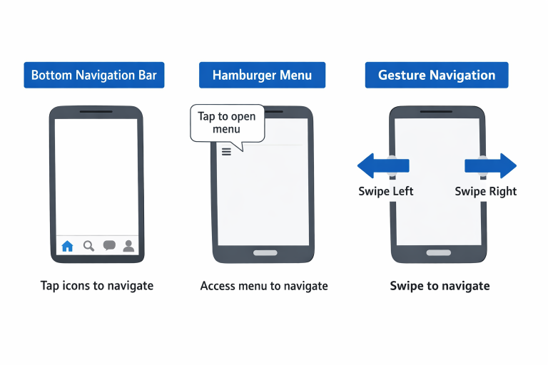
Navigation patterns are essential frameworks guiding users throughout a mobile application. Their structure determines how users move from one feature or section to another. The right pattern makes the journey intuitive, while poor navigation can quickly result in frustration and abandonment. Three of the most common mobile patterns are the bottom navigation bar, the hamburger menu, and gesture-based designs.
- Bottom Navigation Bar: This prominent element sits at the bottom of the screen, offering quick access to primary app sections. Its location caters well to one-handed use, especially on larger screens.
- Hamburger Menu: Using a three-line icon, the hamburger menu hides less-frequented features and settings off-screen for a cleaner interface. However, it can sometimes obscure important functions from immediate view.
- Gesture-Based Navigation: Emerging in recent years, this pattern allows users to swipe, tap, or pinch to navigate. Gestures reduce reliance on visual buttons, offering a sleek and contemporary look and feel.
Pros and Cons of Popular Navigation Patterns
When selecting navigation architecture, it is vital to weigh advantages and challenges for each pattern:
- Bottom Navigation Bar: Its main strength is accessibility, with core features always visible. However, if overloaded with too many tabs or actions, it can become crowded, making it hard to quickly locate key destinations.
- Hamburger Menu: This approach keeps the visual hierarchy clean and uncluttered, reserving space for content. Unfortunately, important pages may go unnoticed if tucked away, negatively impacting engagement and discoverability of key features.
- Gesture-Based Navigation: Gesture-driven apps are seen as modern and minimal. The main drawback is the learning curve; those not familiar with common gestures may feel lost, especially if gestures are undocumented or inconsistent with platform norms.
Designing for Thumb-Friendly Interactions
The “thumb zone” is the area most easily accessible when holding a smartphone with one hand. Effective mobile navigation places interactive elements in this region, allowing users to navigate effortlessly without adjusting their grip. Prioritizing thumb-reachable controls reduces strain, ensuring comfort and minimizing errors. Design choices like prominent bottom navigation bars, floating action buttons, and swipe gestures fall naturally within users’ reach, making repetitive interactions enjoyable and, ultimately, more engaging. In addition to physical ergonomics, it’s important to account for the diversity of device screen sizes and orientations. Some users operate phablets or tablets, so layouts should gracefully scale and reposition navigational controls as needed. Adaptive interfaces that recognize specific device characteristics can adjust the size of touch targets and the spacing between elements, reducing accidental taps and improving comfort for users with different hand spans or grip styles. This adaptability ensures accessibility for left-handed, right-handed, and ambidextrous users alike, making it a mark of inclusive design. Furthermore, supporting adaptive navigation can reduce onboarding friction for new users, as familiar, prominent navigation elements quickly orient them to the app as soon as they open it.
Testing and Iterating Based on User Feedback
Navigation preferences and expectations can differ between demographics or regions. Continuous testing ensures the navigation patterns you choose resonate with your target audience. Prototypes and A/B testing reveal which patterns are most intuitive. Collecting direct user feedback, through surveys, usability tests, or analytics, spotlights bottlenecks and uncovers hidden frustrations. By iterating on designs informed by these insights, mobile teams can refine navigation patterns to better align with how users want to interact.
User-centered iteration doesn’t stop with the initial release. Frequent updates, informed by changing behaviors and evolving device trends, are necessary to keep your app at the forefront of usability. Tracking session durations, navigation flows, and drop-off points with analytics gives clues to where navigation improvements may yield higher retention. Transparency in responding to user suggestions can also drive positive perceptions and brand loyalty, as users notice when their ideas influence functional updates. By mapping user journeys and analyzing real-world behaviors, you can make improvements that go beyond aesthetics and address the practical everyday needs of your target audience.
Conclusion
Creating a seamless user journey starts with thoughtful mobile navigation design. The right choice of navigation pattern, attention to thumb-friendly placements, and continuous improvement through user feedback all combine to deliver a frictionless experience that encourages users to return. As apps continue to evolve, keeping navigation efficient and user-centered will always be at the heart of meaningful engagement and sustained growth. For further reference, comprehensive guides from authorities can help development teams stay on top of emerging trends and best practices. Ultimately, the success of a mobile app’s navigation hinges on its ability to balance initial discoverability with long-term ease of use. By creating a tested, refined, and tailored navigational structure for real users, teams can maximize both short-term conversions and ongoing engagement. As digital ecosystems expand, a robust navigation strategy is not just a feature, as it’s a central pillar for user satisfaction, advocacy, and organic growth. Ongoing investment in navigation usability can set your app apart in a competitive marketplace, ensuring users always feel empowered to explore, discover, and return.

Seamless navigation remains at the core of outstanding digital experiences, and 2026 is shaping up to be an exciting year for innovation in UI menu design. As designers continue to focus on clarity, personalization, and accessibility, the evolution of web design menus addresses new user expectations and technological advancements. Effective navigation not only impacts user satisfaction but also drives higher engagement and conversion rates for businesses targeting online audiences.
The adoption of emerging trends reflects a greater emphasis on meeting users’ needs wherever they are, whether browsing on smartphones, interacting with smart home devices, or accessing content late at night. This article will walk through five critical navigation trends designers are leveraging to build intuitive, attractive, and user-centered menu systems.
Beyond visual appeal, ease of use, and personalization, modern interfaces have become vital. Menus that anticipate user needs, reduce unnecessary clutter, and even support multiple interaction styles (such as touch and voice) can boost productivity and overall enjoyment. The best navigation menus today serve as unobtrusive guides that help users find what they need quickly, regardless of context or device.
To stay competitive, it helps to learn from the best practices shaping the current UI design landscape. From stripped-back layouts to smart menus and beyond, each trend covered in this article plays a unique role in improving digital journeys for everyone.
Minimalist Navigation
Clean interfaces are more than just a stylistic trend. Minimalist navigation is engineered to declutter menus and reduce the number of choices a user must process at any moment. This approach relies on keeping only the most essential links visible, using generous white space, and removing anything that does not enhance the navigation experience.
Recent research shows a significant drop in the number of visible menu items among top digital brands. The primary navigation menus shrank from an average of 8 to just above 5 visible links in two years, resulting in measurable gains in user efficiency. Cognitive load is greatly reduced, and users report feeling less overwhelmed when using websites or apps that embrace minimalist principles.
Personalized and AI-Driven Menus
With advancements in machine learning, there has been a surge in personalized and AI-enhanced navigation menus. Rather than serving the same navigation structure to every visitor, AI-driven menus dynamically adapt to each user’s history, device, and even the time of day. Returning customers might see quick links to favorite pages, while first-time visitors get guided tutorials or simpler menus designed to introduce them to the brand’s offerings.
Leading tech companies and e-commerce giants are already leveraging this approach. For example, features similar to those pioneered by Amazon rely on robust algorithms that analyze individual browsing habits and reorder or spotlight navigation options accordingly. Tailored menus reduce user friction while helping site owners deliver more relevant content, which can increase both time on site and conversions.
Voice-Activated Navigation
Voice-activated interfaces are rapidly moving from novelty to necessity, thanks in part to widespread adoption of voice assistants in smartphones, cars, and smart home devices. Users now expect to interact with navigation components hands-free, asking for menus, products, or page content using natural language. This trend improves accessibility for users with visual or motor impairments and supports multi-tasking behaviors common in modern digital life.
Incorporating a voice search button or activating menus via wake words allows users to bypass traditional navigation hierarchies, reaching their destinations faster and with less effort. Companies adopting well-designed voice UI are not only meeting accessibility standards but are also future-proofing their digital experiences as consumer habits change.
Dark Mode Menus
Dark mode has become a standard offering across devices and platforms. Enhanced by OLED screens and user demand for visually comfortable interfaces, dark-themed menus are celebrated for both style and practicality. Benefitting users who browse in low-light environments, dark mode reduces glare and eye strain. This feature is especially important for users who spend prolonged periods browsing late at night or in dim spaces.
Besides fostering a sleek, modern appearance, dark mode signals a commitment to user customization. It is now common for sites to offer a toggle between dark and light themes, allowing users to choose what best suits their environment and preferences. Popularized by platforms like YouTube and Twitter, this trend continues to grow steadily as users increasingly expect personalized visual experiences.
Gesture-Based Navigation
Touch devices have normalized gesture-based interaction. Swipes, pinches, and taps have replaced some of the clicks and scrolls of earlier eras. This shift calls for navigation systems to become more intuitive, reflecting natural hand movements and mirroring physical interactions users are familiar with from mobile apps.
Swipe gestures are now common for revealing menu panels, refreshing content, or reordering items within a navigation list. These interactions provide a more immersive and seamless experience, especially on mobile platforms. Successful gesture-based navigation anticipates and responds to user intent, making transitions between screens as smooth and engaging as possible. Designers draw inspiration from gaming and app development best practices to keep these gestures fluid and responsive.
Conclusion
Navigation menus set the stage for positive user experiences, reflecting both technological capabilities and evolving user expectations. Minimalist design, personalized AI-driven menus, voice-activated interfaces, dark mode, and gesture-based controls are creating digital environments that are more accessible, efficient, and enjoyable. By embracing these trends, designers and brands position themselves to meet the demands of today’s diverse digital audience, ensuring both engagement and satisfaction in every session.

GlobeInsightBlog stands as a dynamic platform designed to bring readers closer to the pulse of global developments. In an age where information is abundant but clarity is rare, GlobeInsightBlog offers a refreshing approach by combining depth, authenticity, and accessibility. Readers from different parts of the world turn to this platform to explore meaningful discussions that go beyond surface-level reporting. The goal is to provide a comprehensive understanding of events, ideas, and cultural movements shaping our interconnected world.
From emerging economies to technological revolutions, GlobeInsightBlog bridges gaps between regions and perspectives. It emphasizes storytelling that resonates with a global audience while remaining rooted in factual accuracy and thoughtful analysis. This unique combination ensures that readers not only stay informed but also develop a broader worldview. By focusing on quality over quantity, the platform continues to build trust and engagement among its growing readership.
The Vision Behind GlobeInsightBlog
The foundation of GlobeInsightBlog is built on the vision of creating a space where knowledge flows freely across borders. It aims to empower readers with insights that help them make informed decisions in both personal and professional spheres. By addressing complex global topics in a simplified manner, the platform ensures accessibility without compromising on depth or accuracy. This vision reflects a commitment to intellectual curiosity and cultural understanding.
At its core, GlobeInsightBlog values diversity in thought and expression. Contributors from various backgrounds bring unique perspectives that enrich the overall content experience. This collaborative approach allows the platform to present balanced viewpoints on global issues. As a result, readers gain exposure to ideas that challenge assumptions and encourage critical thinking in an ever-changing world.
Content Diversity on GlobeInsightBlog
One of the defining features of GlobeInsightBlog is its diverse range of topics. The platform covers areas such as global politics, economic trends, technological innovation, cultural evolution, and environmental sustainability. This wide spectrum ensures that readers can explore multiple dimensions of global life in one place. Each topic is approached with a focus on clarity, relevance, and real-world impact.
The content is carefully curated to maintain consistency in quality while offering variety in perspective. Whether it is an in-depth analysis of international trade or a reflective piece on cultural traditions, GlobeInsightBlog delivers value through well-researched articles. This diversity not only keeps readers engaged but also encourages them to explore subjects beyond their usual interests, broadening their intellectual horizons.
How GlobeInsightBlog Enhances Global Awareness
GlobeInsightBlog plays a crucial role in enhancing global awareness by presenting information in a context that is both informative and relatable. It connects local events to global trends, helping readers understand how different regions influence one another. This interconnected approach fosters a deeper appreciation of the complexities involved in global interactions.
By highlighting stories from underrepresented regions, GlobeInsightBlog ensures that diverse voices are heard. This inclusive approach allows readers to gain insights into cultures and perspectives they may not encounter elsewhere. As a result, the platform contributes to a more informed and empathetic global community, where understanding replaces misconceptions.
Editorial Approach and Quality Standards
The editorial process of GlobeInsightBlog is centered around accuracy, originality, and readability. Each article undergoes thorough research and careful editing to ensure that it meets high standards of quality. The platform prioritizes authenticity, ensuring that all content is free from plagiarism and reflects genuine human insight.
In addition to maintaining accuracy, GlobeInsightBlog focuses on engaging storytelling. Articles are structured to guide readers through complex topics in a logical and compelling manner. This approach not only enhances readability but also ensures that readers remain engaged from beginning to end, making the learning experience both enjoyable and informative.
Global Trends and Insights on GlobeInsightBlog
GlobeInsightBlog serves as a valuable resource for understanding global trends that shape the future. From technological advancements to shifts in economic policies, the platform provides in-depth analysis that helps readers stay ahead of the curve. These insights are presented in a way that is both accessible and actionable.
The platform also explores the implications of these trends on everyday life. By connecting macro-level developments to individual experiences, GlobeInsightBlog ensures that its content remains relevant to a wide audience. This practical approach allows readers to apply their knowledge in real-world scenarios, enhancing the overall value of the information provided.
Cultural Exploration Through GlobeInsightBlog
Cultural exploration is a key aspect of GlobeInsightBlog, offering readers a window into the traditions, values, and lifestyles of different communities. Through detailed narratives and thoughtful analysis, the platform highlights the richness and diversity of global cultures. This approach fosters a deeper understanding of cultural nuances and shared human experiences.
The platform also addresses the impact of globalization on cultural identities. By examining how cultures evolve and adapt, GlobeInsightBlog provides insights into the dynamic nature of human societies. This exploration not only educates readers but also promotes respect and appreciation for cultural diversity in a rapidly changing world.
Technology and Innovation Insights
Technology plays a significant role in shaping the modern world, and GlobeInsightBlog provides comprehensive coverage of this ever-evolving field. The platform explores innovations that influence industries, economies, and daily life. By breaking down complex technological concepts, it ensures that readers can easily understand their significance.
In addition to highlighting advancements, GlobeInsightBlog examines the challenges associated with technological growth. Topics such as data privacy, digital transformation, and ethical considerations are discussed in detail. This balanced approach allows readers to gain a holistic understanding of technology’s impact on society.
Sample Insight Table on GlobeInsightBlog Topics
| Category | Focus Area | Reader Benefit |
|---|---|---|
| Global Politics | Policy and diplomacy | Better understanding of governance |
| Technology | Innovation trends | Awareness of digital transformation |
| Culture | Traditions and lifestyles | Broader cultural appreciation |
| Economy | Market analysis | Insight into financial trends |
| Environment | Sustainability | Knowledge of ecological issues |
This table illustrates how GlobeInsightBlog organizes its content to deliver targeted insights across various domains. Each category is designed to provide specific value to readers, ensuring a comprehensive learning experience.
Building a Community Through GlobeInsightBlog
GlobeInsightBlog is more than just a content platform; it is a community of thinkers, readers, and contributors. It encourages interaction and dialogue among its audience, creating a space where ideas can be shared and discussed. This sense of community enhances the overall experience, making it more engaging and meaningful.
The platform also supports collaboration by inviting contributions from experts and enthusiasts alike. This inclusive approach allows for a diverse range of voices, enriching the content and fostering a sense of belonging among readers. As a result, GlobeInsightBlog continues to grow as a vibrant hub for global perspectives.
Another Insight Table Highlighting Reader Engagement
| Feature | Purpose | Outcome |
| Expert Articles | Provide depth | Increased credibility |
| Reader Contributions | Encourage participation | Stronger community engagement |
| Interactive Content | Enhance experience | Higher reader retention |
| Global Topics | Expand knowledge | Broader audience reach |
This table demonstrates how GlobeInsightBlog integrates various features to create an engaging and informative platform. Each element contributes to a richer user experience, ensuring that readers remain connected and invested.
Future of GlobeInsightBlog in a Globalized World
As the world becomes increasingly interconnected, the role of platforms like GlobeInsightBlog becomes even more significant. The platform is poised to expand its reach by embracing new technologies and innovative content formats. This forward-thinking approach ensures that it remains relevant in an ever-changing digital landscape.
Looking ahead, GlobeInsightBlog aims to continue its mission of providing reliable and insightful content. By staying true to its core values of quality and authenticity, it will continue to serve as a trusted source for global perspectives. This commitment to excellence ensures that the platform will remain a valuable resource for years to come.
Conclusion
GlobeInsightBlog distinguishes itself through its dedication to quality, diversity, and global understanding. It offers a unique blend of insightful analysis and engaging storytelling, making it a go-to platform for readers seeking meaningful content. By addressing a wide range of topics, it ensures that there is something for everyone.
Ultimately, GlobeInsightBlog succeeds because it connects people through knowledge and shared understanding. It empowers readers to explore the world from different perspectives, fostering a sense of curiosity and awareness. As a result, it continues to build a loyal audience that values depth, authenticity, and global insight.

-

 Blog5 months ago
Simpcit6: Redefining Simplicity in a Complex World
-

 Blog9 months ago
Baddi Hub: An Emerging Industrial and Business Hotspot
-

 food9 months ago
Calamariere: How to Perfectly Prepare at Home
-

 Technology9 months ago
YourAssistantLive com: The Future of Smart Digital Assistance
-

 Health8 months ago
Nerovet AI Dentistry: Enhancing Patient Experience and Treatment Outcomes Dental Care
-

 Technology5 months ago
Voomixi com: The Digital Platform Redefining Online Interaction
-

 Business7 months ago
Top Benefits of Using Quality Wire Rope Lube in US Heavy Industry
-

 Technology8 months ago
Anonibs: The Trending Anonymous Image Board Platform